top of page


Hekka Fresh Games | Space Critters
Space Critters is a journey to save the universe’s most adorable creatures.
The game was created to feel friendly from the first tap, blending lighthearted visuals with fast puzzle-arcade gameplay. It’s meant for kids, families, and puzzle fans who just want to pick up a game and play.
Iconography | Store Items | Game Tiles
Store Items are separated into two categories, individual items and packages. Packages are color coded. Gold being the most expensive, blue being the most affordable.

Design goal: Create a consistent look for each tile that is easy, efficient to replace and follows the theme of the style guide.
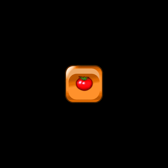
Gameplay Tiles are the main tiles that the player will interact with. Each level has one of four repeatable color tiles with an on/off state. They are containers for the level's primary fruit.
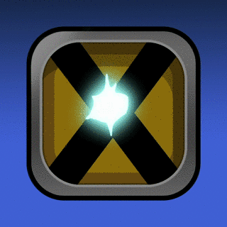
Challenge Tiles appear before a level challenge.
The Frozen Tile Challenge has the periodic table symbol for water in an ice block. The electricity challenge design has the universal high voltage symbol.
XP Items One set per level. Each item has three states that change as the player progresses through the level.
Iconography | Buttons On & Off States | Earnables

Level Indicators
Before starting a level, the player will see a Level Indicator with a fruit displayed at the top of their menu. I designed the Indicator bubble shape with two layers; a transperant glossy layer for the front and a gradient background layer. This design allows an easy plug in of each fruit according to the level it is featured on.

Stage Design
Space Critters is separated into 5 stages with 20 levels per. The design for each stage corresponds with the main story quest. Stage 1: Farmland, Stage 2: Volcano Area, Stage 3: Sky, Stage 4: Space, Stage 5: The Moon. When combined with the correct gameplay tiles the theme of each stage begins to take shape.


In-Game Tile Animations
I created an animated preview for each Gameplay Tile on After Effects. Each preview is intended to demonstrate exactly how every tile should function on a live game board. Once each animation preview was finalized, I separated the individual layers and exported into Adobe Animate for SpriteSheet creation.


Spritesheets
In total I created 121 SpriteSheets that make up all of the In-game animations. The SpriteSheets are mainly designed for efficiency. They also solved the huge design problem of not having the skills or resources to create assets on 3d Modeling Software. SpriteSheets allowed me to manually animate every aspect of the game and provide a developer with assets that could be plugged directly into the game.
By stacking SpritSheets together we can easily combine the tomato and orange tile into one "Fruit Tile". When the Fruit Tile appears on the board, both SpriteSheets are triggered causing a seamless animation to play. (See above) This Fruit Tile can appear at random multiple times until the level ends. All 20 levels have one variation of a Fruit Tile and numerous animating game tiles that function in the same manner. The SpriteSheets are pixel perfect to allow all gameplay elements and visuals to be easily updatable.

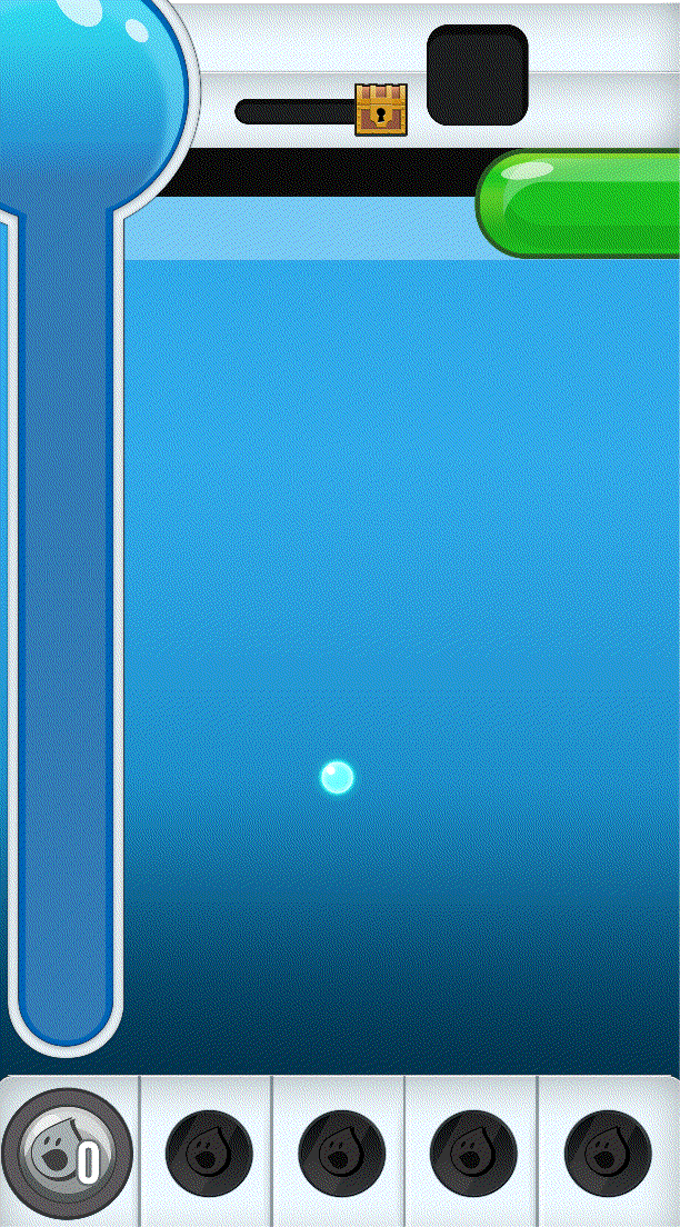
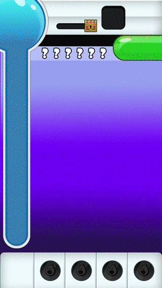
WaterKing Beam
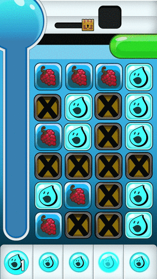
This is one of the main gameplay mechanics in Space Critters™/B27. The player loses when the board fills up with the tiles that carry an X. This beam will clear out those tiles. In order to use it the player must first collect enough matching tiles to fill the meter. Filling the meter allows the player to activate the beam and then select which column to shoot.
This creates the main gameplay loop where the player constantly has to clear out the X's using the beam in order to collect enough Fruit Tiles to beat the level before time runs out.
The design of this mechanic is intended to spur a fun interaction that keeps the player engaged. Visually the color chosen contrasts from the rest of the tiles on the game board to highlight importance.

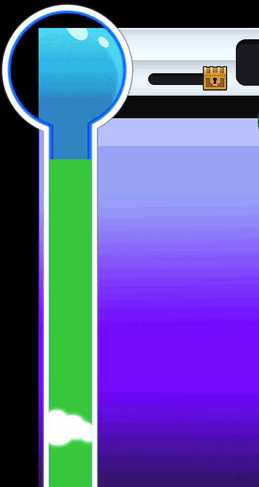
Animated Transitions
I designed/animated, the Countdown Clock, Level Up, and Foam animations to create a sense of urgency and reward during game play.
Countdown Clock is a simple notification animation designed to stress out the player if they aren't ready to begin.
When the player takes Fruit Tiles off the game board each tile turns into a green orb that will float into the tube causing the foam to rise. The Foam animation is designed to show the player they are getting closer to their goal.
Reaching the top earns a medal and advances the player to the next tier where the level changes in difficulty. A minute is added. The XP Items on the game board change into their next state as a visual que to show the player they have advanced. *XP change not shown in animation. Please see game :)

High Fidelity Mock Ups
These mock ups were provided to the developers as a visual representation to build the game. They are designed to demonstrate the final look and feel for each stage.


UI Overview
The UI in Space Critters was built for kids and families, so everything had to be obvious without reading instructions. I designed the flow to move players naturally from the load screen into gameplay, with tutorials and menus easy to reach at any time. Instead of relying on text, I focused on visual cues, animation, and simple interactions to teach the game. That approach kept the experience clear and avoided localization problems, which mattered since the game launched in over 100 countries.


Localized in Spanish | Pop Up Screens
The game is localized in Spanish for Latin America. Contextual pop-ups are used to guide players and deliver tips during gameplay.

Marketing Design | Landing Page
The landing page for Space Critters is designed primarily for conversions, directing users to the available product pages. It includes links to merchandise and social media while maintaining the lighthearted, playful branding style of Space Critters.

User Acquisition Design


bottom of page